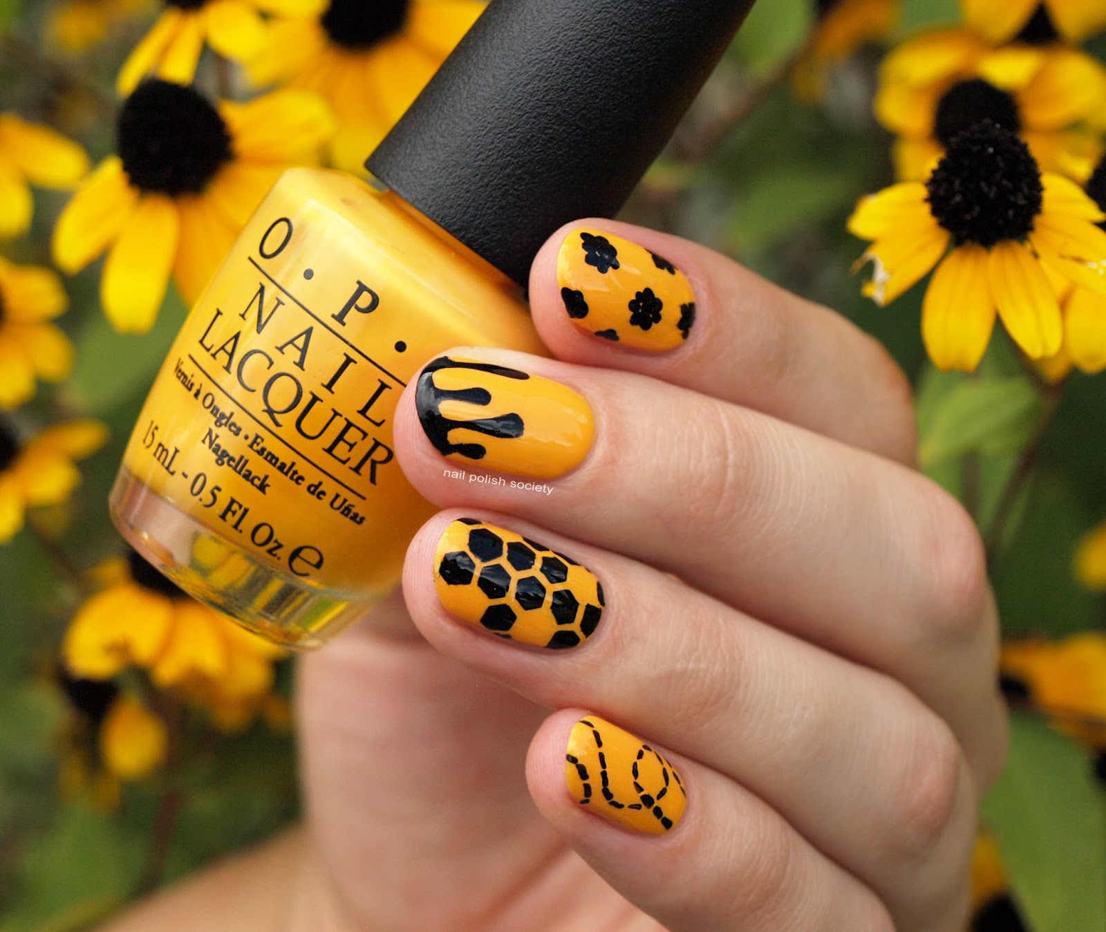
Hey ladies! Day three of the 31 Day Challenge and I'm so excited about this mani! This is one of the only designs I've had planned out for the month. It may look familiar because I was inspired by this bee mani from Chalkboard Nails, one of my all time favorites of hers. I've been wanting to recreate it ever since and now seemed like the perfect time. It may have something to do with these beautiful black eyed susans (?) in my yard that match so well!
Showing posts with label yellow. Show all posts
Saturday, September 3, 2016
Thursday, September 4, 2014
31DC2014 Day 03: Yellow Mod Geometrical
Today was a chance to try another new technique- stamping decals. I had attempted this once before and it was a disaster. I had been scared off for some time, but finally roused up enough courage for a second attempt. I still don't really understand the tricks behind a successful stamp decal. But I managed to figure it out well enough to enjoy today's result, and to want to keep trying.
Sunday, September 29, 2013
31DC2013 Day 28: Inspired by a Flag
As you learned from my Day 24: Inspired by a Book post, I am a map nerd. I believe it naturally follows that I also love flags. There were a number of viable options I kicked back and forth. Finally I decided on the Gadsden flag because I think it's so cool. According to Wikipedia, it's named after the general who designed it during the American Revolution. I recently read "1776", which gave me so much insight and renewed interest into the War's history. I just love the attitude that this flag represents.
And since we're on the subject, here's a little story for you. When I was little I had a hiding spot on top of our roof. It was like my little kingdom. I gave it a name and drew a flag for it. I seem to recall I even tried creating my own nation anthem. If I still had that drawing I would totally do that for today's prompt.
I have the diamonds to represent the eastern diamondback rattlesnake. I used striping tape to create the shapes. I filled them in with polish and quickly removed the tape one at I time. I made sure to lay down the tape on each finger in the same order so that I would remember the sequence to remove them. They ended up bleeding when I applied Out The Door top coat (grr..). So on my thumb and ring finger I used big globs of Seche Vite and didn't have any problems with the images smudging.
What I used:
Sephora by OPI Yellow My Name is Betsey- yellow
Sephora by OPI I Come In Peas- green
Sephora by OPI Studs and Stilettos - brown
It's So Easy Stripe Rite in black
The other thing that I like about this flag? The motto is also a title of an awesome Metallica song! It's kinda been stuck in my head this entire time.
Tuesday, September 3, 2013
31DC2013 Day 03: Yellow Nails
How is it only Day 3? I swear it's been at least a week already...
For today I created a "cartoon nails" manicure. My reasoning is that yellow polish is somehow already a little cartoon-y by itself. Only, it might not have been the best shade choice for this look, because the white doesn't contrast well on it. I'll try it again sometime with a more saturated shade like pink or red.
But I digress. These are still cool. They're kind of trippy to look at. Enjoy!
What I used:
Sephora by OPI Yellow My Name is Betsey
Sephora by OPI What's A Tire Jack?
Sephora by OPI White Hot
China Glaze Matte Magic
I hope you're having as much fun with this challenge as I am!
For today I created a "cartoon nails" manicure. My reasoning is that yellow polish is somehow already a little cartoon-y by itself. Only, it might not have been the best shade choice for this look, because the white doesn't contrast well on it. I'll try it again sometime with a more saturated shade like pink or red.
But I digress. These are still cool. They're kind of trippy to look at. Enjoy!
I started with three coats of the yellow. Then I outlined the nails in black polish with a striping brush. Next I painted on the white with a striping brush and dotting tool. I finished it all off with a matte top coat. Viola!
What I used:
Sephora by OPI Yellow My Name is Betsey
Sephora by OPI What's A Tire Jack?
Sephora by OPI White Hot
China Glaze Matte Magic
I hope you're having as much fun with this challenge as I am!
Friday, July 19, 2013
Barielle Swatches
Here is my first attempt at swatching! It was a little more work than I anticipated. So I don't know how much I want to do it in the future. I probably just need more practice. Also, some of the photos didn't come out like I wanted. I'll start off with the worst ones first :).
I had high hopes for Banana Drop and was a little disappointed. The color on the website and even in the bottle itself looks somewhat muted, which is what I hope for. It ended up being brighter than I wanted. It was also really goopy, as light colors tend to go. This took three coats.
Lilac Jelly Bean was also more goopy than I expected, but this only took two coats. I like that it has just a hint of the lilac in a greige color.
I had high hopes for Banana Drop and was a little disappointed. The color on the website and even in the bottle itself looks somewhat muted, which is what I hope for. It ended up being brighter than I wanted. It was also really goopy, as light colors tend to go. This took three coats.
Lilac Jelly Bean was also more goopy than I expected, but this only took two coats. I like that it has just a hint of the lilac in a greige color.
Slate of Affairs was hard to photograph because of the blue shimmer in it. The application was easier, I did two coats, and I really like the color. This was the best shot I took indoors.
This is with the flash, it shows the blue shimmer:
In the direct sunlight you can see how much the color changes:
Falling Star is fun. I don't have anything else like it. It is thicker than I expected, but didn't have any big issues with application. On the website it is described as "marine blue with gold glitter". As you can tell it is not gold, rather it is an obvious copper, which their picture even shows pretty true to color.
Soho at Night is a beautiful dark plum creme. It's such a romantic color. As soon as I put it on I wanted to go out on a nice date. Yep, it made me feel like that as I was lounging in my sweatpants watching t.v. reruns. The formula was nice and smooth. I did two coats which looked good in person but looking at the photo maybe I should have used three.
Blue Cotton Candy is another fun color. I think their description of it though is the worst out of the bunch. It's described as "frosted opalescent sea blue". Basically they really couldn't pin it down so they threw in some random adjectives. It's understandable because it does look so different. It has a really dense silver shimmer that makes it looks textured, but it's not at all opalescent. The formula was thick here too. Some of my fingers I only have one coat on, the others I did two just for good measure.
Indirect sunlight:
Direct sunlight:
Hidden Hideaway was another good formula, it was smooth and opaque in two coats. It's a vampy shimmery purple that really shows up in the sunlight.
Daring Dahlia is the one I am least crazy about. It was described as "deep fuchsia with shimmer". So I was pretty disappointed when it turned out to be just regular fuchsia. At least it had the best application out of the whole bunch. Two coats.
Indirect sunlight:
Direct sunlight:
So that was all of them. As tempted as I am to try more of their polishes, I think I will wait until I see the swatches first.
Again I apologize for the inconsistent and lame photos. I'm still trying to figure out how to use my camera to take pictures of other things besides my kids.
Subscribe to:
Posts (Atom)