Hello lovelies! I have six of the newest shades from piCture pOlish to share with you. Free was released a little earlier as a gift with purchase but I'm including it in this post with the other five. As you can see, all of these shades fall in the blue and green color families. You would think that might be a little boring but not at all as they are all so different!
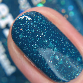
Free is a shifting teal to blue jelly scatter holographic. It's really complex and a perfect peacock color. This was a one coater, but I applied two anyway. Shown without top coat.
Here's a comparison with Free and Mermaid. You can see they're both pretty similar in color, but the finishes are very different.
Here's a comparison with Soul and Freya's Cats. My photo makes them look a little more similar than they are. Soul is a little more purple in person.
Mermaid is a deep teal/turquoise creme/jelly with scatter holographic and holo hex glitters. This shade is highly pigmented and more creme than jelly which really hides the glitters. Shown is two coats plus top coat.
You can see Mermaid is much more blue than Meow and more saturated than Free and Ocean.
This photo actually turned out spot on! Showing Blue compared to Freya's Cats and Forget Me Not.
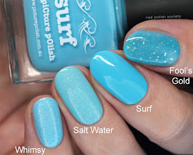
Once again these colors were hard to capture exactly. Surf if a little brighter and more saturated in person. You can see in comparison that Salt Water and Whimsy are lighter, and Fool's Gold is more turquoise.
Although I couldn't get Oasis to photographic accurately this should give you a better idea of the color. Chillax is lighter and more minty blue in comparison and Marine is darker and teal.
You can purchase these shades from the piCture pOlish website or one of their international stockists.
What are your favorite shades? I like them all but if Mermaid had been made a little more jelly like it would have been my favorite. Let me know your thoughts in the comments below!


No comments:
Post a Comment
I love to hear your comments!